HTML CSS
flex-direction 속성
햄발자
2024. 7. 15. 16:16
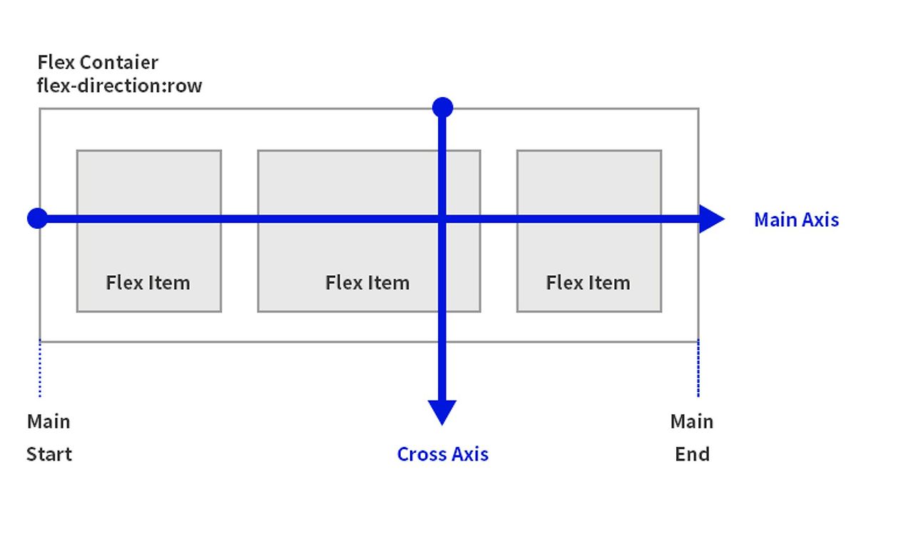
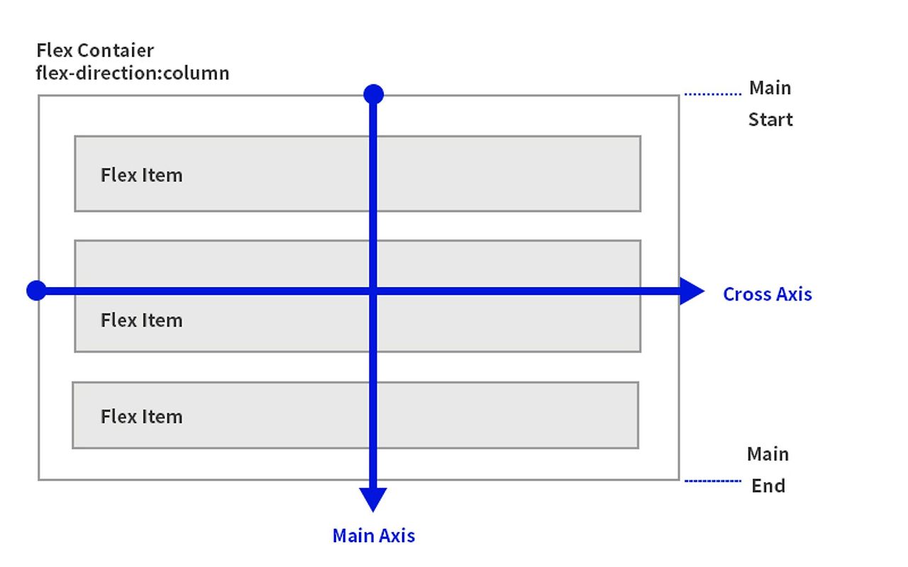
FlexBox 의 축
flexbox 레이아웃의 정렬을 이해하는데 가장 중요한 역할을 하게 됩니다. 주축( main axis)의 방향과 교차축 (cross axis )의 방향을 결정하는 flex-direction 이라는 속성이 있습니다. flex-direction의 기본값은 row 입니다.
주축 방향(main axis)
Flex container에 선언된 flex-direction의 값에 따라 자식 요소인 flex item이 나열되는 방향입니다. flex-direction:row 인 경우는 주축이 수평이 되고 flex-direction:column인 경우는 주축이 수직 방향이 됩니다.
교차축 방향(cross axis )
Flex container의 주축에 직각을 이루는 축으로 주축이 수평이며 교차축은 수직 방향이 됩니다.
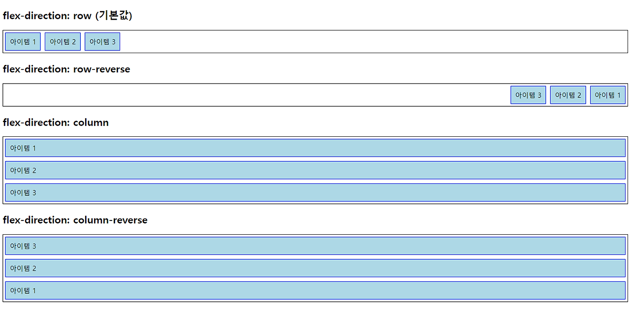
flex-direction 속성
flex-direction 속성은 주 축의 방향을 설정합니다.
- row : 아이템들을 수평으로 배치합니다 (기본값).
- row-reverse : 아이템들을 수평으로 배치하되, 반대 방향으로 배치합니다.
- column : 아이템들을 수직으로 배치합니다.
- column-reverse : 아이템들을 수직으로 배치하되, 반대 방향으로 배치합니다.
시나리오 코드 1
<!DOCTYPE html>
<html>
<head>
<meta charset="UTF-8">
<title>인라인블록 요소 예시</title>
<style type="text/css">

	.container {
		display: flex;
		border: 1px solid black;
		flex-direction: row;
	}
	.item {
		background-color: lightblue;
		padding: 10px;
		margin: 5px;
		border: 1px solid blue;
	}

</style>
</head>
<body>
	<!-- <http://localhost:8080/demo1/demo_03.html>  -->
	<h1>여기는 demo_03.html 파일 입니다.</h1>
	<br>

	<h3>flex-direction : row(기본값)</h3>
	<div class="container">
		<div class="item">아이템1</div>
		<div class="item">아이템2</div>
		<div class="item">아이템3</div>
	</div>

	<h3>flex-direction : row-reverse</h3>
	<div class="container" style="flex-direction: row-reverse;">
		<div class="item">아이템1</div>
		<div class="item">아이템2</div>
		<div class="item">아이템3</div>
	</div>

	<h3>flex-direction : column</h3>
	<div class="container" style="flex-direction: column;">
		<div class="item">아이템1</div>
		<div class="item">아이템2</div>
		<div class="item">아이템3</div>
	</div>

	<h3>flex-direction : column-reverse</h3>
	<div class="container" style="flex-direction: column-reverse;">
		<div class="item">아이템1</div>
		<div class="item">아이템2</div>
		<div class="item">아이템3</div>
	</div>

</body>
</html>
시나리오 코드 2
<!DOCTYPE html>
<html>
<head>
<meta charset="UTF-8">
<title></title>
<style type="text/css">
.navbar {
display: flex;
border: 1px solid black;
background-color: #f8f9fa;
padding: 10px;
}
.nav-item {
margin: 5px;
padding: 10px;
background-color: lightblue;
color: white;
text-align: center;
border-radius: 4px;
text-decoration: none;
}
.section {
height: 300px;
padding: 20px;
margin-top: 20px;
border: 1px solid #000;
}
</style>
</head>
<body>
<!-- http://localhost:8080/demo1/demo_04.html -->
<h1>여기는 demo_04.html 파일 입니다.</h1>
<br>
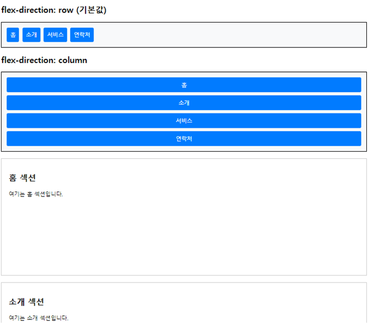
<h2>flex-direction: row</h2>
<div class="navbar">
<a href="#home" class="nav-item" >홈</a>
<a href="#about" class="nav-item" >소개</a>
<a href="#services" class="nav-item">서비스</a>
<a href="#contact" class="nav-item">연락처</a>
</div>
<h2>flex-direction: column</h2>
<div class="navbar" style="flex-direction: column;">
<a href="#home" class="nav-item">홈</a>
<a href="#about" class="nav-item">소개</a>
<a href="#services" class="nav-item">서비스</a>
<a href="#contact" class="nav-item">연락처</a>
</div>
<div class="section" id="home">
<h2>홈 섹션</h2>
<p>여기는 홈 섹션 영역입니다.</p>
</div>
<div class="section" id="about">
<h2>소개 섹션</h2>
<p>여기는 소개 섹션 영역입니다.</p>
</div>
<div id="services" class="section">
<h2>서비스 섹션</h2>
<p>여기는 서비스 섹션입니다.</p>
</div>
<div id="contact" class="section">
<h2>연락처 섹션</h2>
<p>여기는 연락처 섹션입니다.</p>
</div>
</body>
</html>