Flutter 플러터 - 폰트 설정, 로컬 이미지
Flutter 앱 개발에서 자주 사용되는 asset과 로컬 폰트 설정 방법
asset이란?
- asset은 앱 구성에 필요한 리소스 파일들을 의미합니다. 예로 아이콘, 이미지, JSON 파일, 폰트 파일 등이 있습니다.
- 이러한 리소스는 앱 빌드 시 내부에 포함되어야 하며, 이를 위해 pubspec.yaml 파일에 등록이 필요합니다.
Text 위젯에서 로컬 폰트(fontFamily) 설정하기
Flutter에서 Text 위젯의 fontFamily를 로컬 폰트로 설정하려면, asset으로 폰트를 등록한 후 사용해야 합니다.
구글에서 제공하는 폰트
Browse Fonts - Google Fonts
Making the web more beautiful, fast, and open through great typography
fonts.google.com
Sunflower 검색

Get font 클릭

Download all(1) 클릭

C 드라이브 tools 폴더에 Sunflower.zip를 저장한 후 압축 풀기 클릭

Sunflower 폴더 확인

class_v02 우클릭 후 폴더 assets 생성
assets 우클릭 후 폴더 fonts 생성 후
압축풀기 한 Sunflower 폴더의 파일
Sunflower-Bold.ttf
Sunflower-Light.ttf
Sunflower-Medium.ttf
복사 붙여넣기

pubspec.yaml 파일에서
아래와 같이 폰트 설정

fonts:
     - family: Sunflower
       fonts:
         - asset: assets/fonts/Sunflower-Bold.ttf
         - asset: assets/fonts/Sunflower-Light.ttf
         - asset: assets/fonts/Sunflower-Medium.ttf
내 이미지 파일 올리는 방법
이미지 파일 사이트
Lorem Picsum
Lorem Ipsum... but for photos
picsum.photos
assets 폴더 우클릭 후 images 폴더 생성
사진파일 아무거나 images 폴더에 넣는다.
a.png
b.png

pubspec.yaml 파일에서
아래와 같이 이미지 파일 설정 가능

  assets:
     - assets/images/
#    - images/a.png 하나씩 지저시 사용
main2.dart
동작여부 확인안함
import 'package:flutter/material.dart';

void main() {
  runApp(MyApp2());
}

class MyApp2 extends StatelessWidget {
  const MyApp2({super.key});

  @override
  Widget build(BuildContext context) {
    return MaterialApp(
      home: Scaffold(
        body: Center(
          child: Column(
            children: <Widget> [
              // 로컬 폰트 사용
              Text('Hello, with Custom Font',
              style: TextStyle(
                fontSize: 24
               ),
              ),

              Text('Hello, with Custom Font',
                style: TextStyle(
                    fontFamily: 'Sunflower',
                    fontSize: 24
                ),
              ),
              // 로컬 이미지 가져오기
              Image.asset('assets/images/a.png',
                width: 200,
                height: 200,
                fit: BoxFit.cover,
              ),
              // 네트워크 상에 존재하는 이미지 렌더링 방법
              Image.network('https://picsum.photos/200/300',
                width: 300,
                height: 300,
                loadingBuilder: (context, child, loadingProgress) {
                  if(loadingProgress == null) {
                    return child;
                  } else {
                    return CircularProgressIndicator(
                      value: loadingProgress.expectedTotalBytes != null
                          ? loadingProgress.cumulativeBytesLoaded / (loadingProgress.expectedTotalBytes ?? 1)
                          : null,
                    );
                  }
                },
              )

            ],
          ),
        ),
      ),
    );
  }
}

MaterialApp color theme와 Material 3 색상
- useMaterial3를 사용하면, Material 라이브러리의 최신 버전 사용 가능 (주류 대중성 가능성이 있으므로 참고하라고 함)
- useMaterial3와 seedColor, Theme.of(context).colorScheme를 사용하면, Material 3 디자인 가이드에 따른 색상값을 사용할 수 있음
- 주요 Theme.of(context).colorScheme
- primary/primaryContainer: 강조 요소
- secondary/secondaryContainer: 보조 요소
- tertiary/tertiaryContainer: 세부 요소 (스펠링 오류로 수정)
- colorScheme.primary와 colorScheme.primaryContainer 차이: primary는 강조 색상, primaryContainer는 강조 색상의 배경 색상
- 주요 Theme.of(context).colorScheme
main3.dart
import 'package:class_v02/main2.dart';
import 'package:flutter/material.dart';

void main() {
  runApp(MaterialApp(
    title: 'MyApp3',
    theme: ThemeData(
      useMaterial3: true,
      // colorScheme: ColorScheme.fromSeed(seedColor: Colors.blue),
      colorScheme: ColorScheme.fromSeed(seedColor: Colors.orange),
    ),
    home: MyHomePage(),
  ));
}

class MyHomePage extends StatelessWidget {
  const MyHomePage({super.key});

  @override
  Widget build(BuildContext context) {
    return SafeArea(child: Scaffold(
      appBar: AppBar(
        title: Text('My App 3', style: TextStyle(color: Theme.of(context).colorScheme.primary),),
      ),
      // backgroundColor: Colors.blue,
      backgroundColor: Theme.of(context).colorScheme.primaryContainer,
      body: Column(
        children: [
          Container(
            color: Theme.of(context).colorScheme.secondary,
            width: 50,
            height: 50,
          ),

          Container(
            color: Theme.of(context).colorScheme.secondaryContainer,
            width: 50,
            height: 50,
          ),

          Container(
            color: Theme.of(context).colorScheme.tertiary,
            width: 50,
            height: 50,
          ),

          Container(
            color: Theme.of(context).colorScheme.tertiaryContainer,
            width: 50,
            height: 50,
          ),

          Container(
            color: Theme.of(context).colorScheme.primary,
            width: 50,
            height: 50,
          )
        ],
      ),
    ),
    );
  }
}

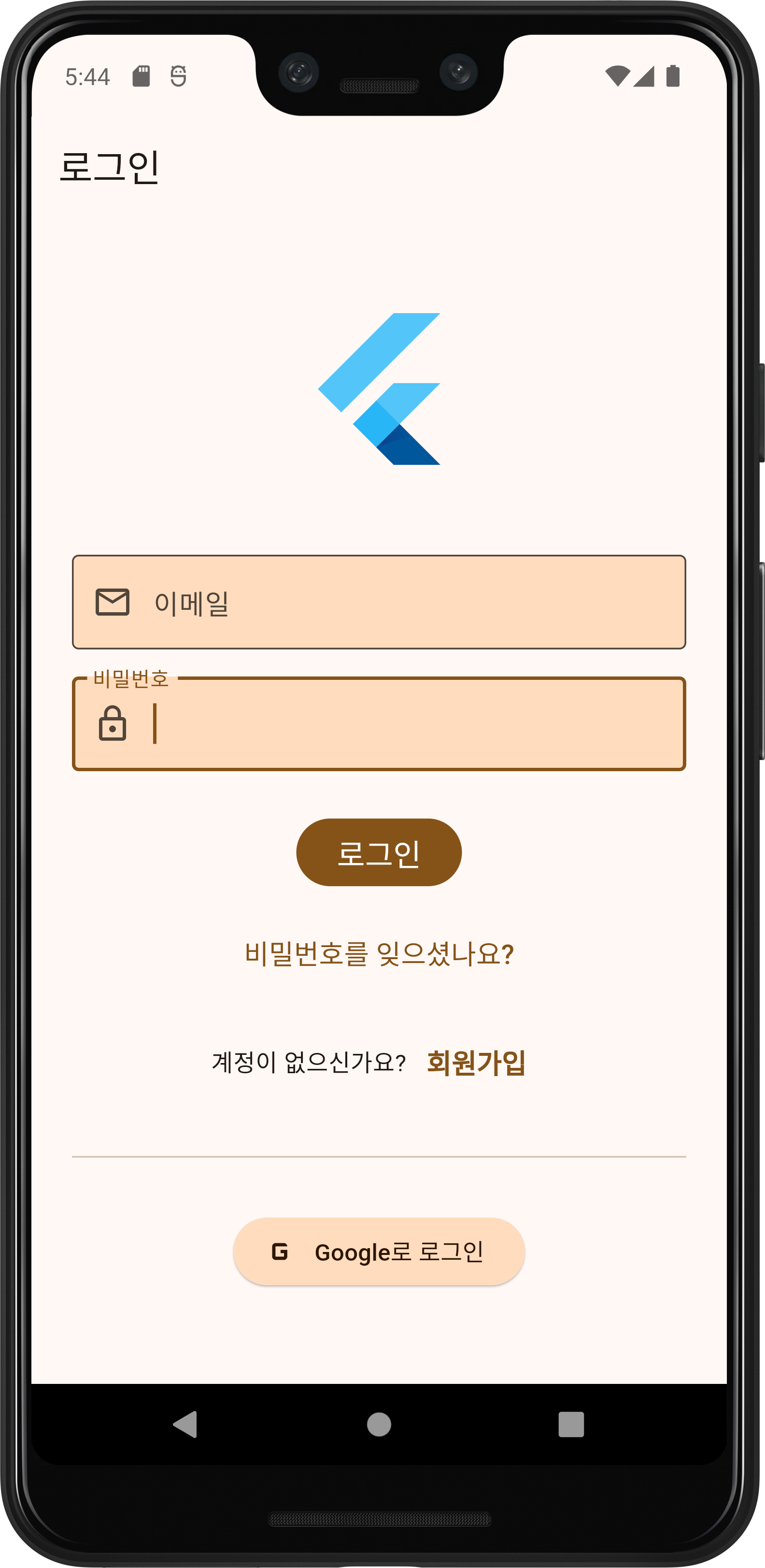
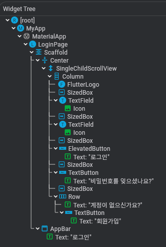
풀이
import 'package:flutter/material.dart';

void main() {
  runApp(const MyApp());
}

class MyApp extends StatelessWidget {
  const MyApp({Key? key}) : super(key: key); // MyApp의 생성자

  @override
  Widget build(BuildContext context) {
    // 위젯 트리를 빌드하고 반환하는 메서드
    return MaterialApp(
      debugShowCheckedModeBanner: false, // 디버그 배너 제거
      theme: ThemeData(
        useMaterial3: true, // 머티리얼 디자인 3 사용
        colorScheme: ColorScheme.fromSeed(seedColor: Colors.orange), // 시드 색상으로 색상 테마 생성
      ),
      home: const LoginPage(), // 홈 화면으로 LoginPage 위젯을 사용
    );
  }
}

class LoginPage extends StatelessWidget {
  // 로그인 페이지를 위한 StatelessWidget
  const LoginPage({Key? key}) : super(key: key); // LoginPage의 생성자

  @override
  Widget build(BuildContext context) {
    // 로그인 페이지의 위젯 트리를 빌드하고 반환
    return Scaffold(
      appBar: AppBar(
        // 머티리얼 3 스타일의 앱바 추가
        title: const Text('로그인'), // 앱바 제목 설정
      ),
      body: Center(
        // 내용물을 중앙에 배치
        child: SingleChildScrollView(
          // 화면이 작을 때 스크롤 가능하게 함
          padding: const EdgeInsets.symmetric(horizontal: 24.0), // 좌우 패딩 설정
          child: Column(
            mainAxisAlignment: MainAxisAlignment.center, // 수직 중앙 정렬
            children: [
              const FlutterLogo(size: 100), // Flutter 로고 추가
              const SizedBox(height: 48.0),
              TextField(
                // 이메일 입력 필드
                decoration: InputDecoration(
                  labelText: '이메일',
                  prefixIcon: const Icon(Icons.email_outlined),
                  border: const OutlineInputBorder(),
                  filled: true, // 머티리얼 3의 채워진 입력 필드 스타일
                  fillColor: Theme.of(context).colorScheme.secondaryContainer,
                ),
              ),
              const SizedBox(height: 16.0),
              TextField(
                // 비밀번호 입력 필드
                obscureText: true, // 입력된 텍스트를 숨김 처리
                decoration: InputDecoration(
                  labelText: '비밀번호',
                  prefixIcon: const Icon(Icons.lock_outline),
                  border: const OutlineInputBorder(),
                  filled: true,
                  fillColor: Theme.of(context).colorScheme.secondaryContainer,
                ),
              ),
              const SizedBox(height: 24.0),
              FilledButton(
                // 머티리얼 3에서 새로 추가된 FilledButton 사용
                onPressed: () {
                  // TODO: 로그인 로직 추가
                },
                child: const Text(
                  '로그인',
                  style: TextStyle(fontSize: 18.0),
                ),
              ),
              const SizedBox(height: 12.0),
              TextButton(
                // 비밀번호 찾기 버튼
                onPressed: () {
                  // TODO: 비밀번호 찾기 페이지로 이동
                },
                child: const Text(
                  '비밀번호를 잊으셨나요?',
                  style: TextStyle(fontSize: 16.0),
                ),
              ),
              const SizedBox(height: 16.0),
              Row(
                // 회원가입 안내 문구와 버튼
                mainAxisAlignment: MainAxisAlignment.center,
                children: [
                  const Text('계정이 없으신가요?'),
                  TextButton(
                    onPressed: () {
                      // TODO: 회원가입 페이지로 이동
                    },
                    child: const Text(
                      '회원가입',
                      style: TextStyle(
                        fontSize: 16.0,
                        fontWeight: FontWeight.bold,
                      ),
                    ),
                  ),
                ],
              ),
              const SizedBox(height: 24.0),
              const Divider(), // 구분선 추가
              const SizedBox(height: 24.0),
              ElevatedButton.icon(
                // 머티리얼 3 스타일의 ElevatedButton.icon 사용
                onPressed: () {
                  // TODO: 소셜 로그인 로직 추가
                },
                icon: const Icon(Icons.g_mobiledata),
                label: const Text('Google로 로그인'),
                style: ElevatedButton.styleFrom(
                  backgroundColor: Theme.of(context).colorScheme.primaryContainer,
                  foregroundColor: Theme.of(context).colorScheme.onPrimaryContainer,
                ),
              ),
            ],
          ),
        ),
      ),
    );
  }
}
머터리얼 디자인 3는 구글이 최신 디자인 트렌드와 사용자 경험을 반영하기 위해 도입한 새로운 디자인 시스템입니다.
ThemeData에서 colorScheme: ColorScheme.fromSeed(seedColor: Colors.orange)와 같이 시드 색상을 활용하면 다음과 같은 이점.
- 자동 색상 팔레트 생성
시드 색상 하나만 지정하면 머터리얼 디자인 가이드라인에 따라 다양한 톤과 명도의 색상 팔레트가 자동으로 생성됩니다. 이를 통해 디자인의 일관성을 유지하면서도 손쉽게 테마를 설정할 수 있습니다. - 유연한 테마 변경
시드 색상만 변경하면 전체 앱의 색상 테마가 변경되므로, 다양한 테마를 쉽게 적용하거나 A/B 테스트를 수행할 수 있습니다. - 접근성 보장
자동으로 생성된 색상 팔레트는 명도 대비 등 접근성 기준을 충족하도록 설계되어, 추가적인 조정 없이도 접근성이 높은 디자인을 구현할 수 있습니다. - 시간과 비용 절감
수동으로 각 색상을 지정할 필요 없이, 시드 색상 하나로 전체 팔레트를 관리할 수 있어 개발 시간과 디자인 리소스를 절약할 수 있습니다.
StatefulWidget과 StatelessWidget 알아 보기
- StatelessWidget: 상태를 관리하지 않는 정적 위젯
- StatefulWidget: 상태를 관리하는 동적 위젯
StatefulWidget과 StatelessWidget 코드 작성의 차이
- StatelessWidget은 상속받은 위젯은 build() 함수를 재정의하여 위젯을 생성함
- Android Studio에서 stless라고 친 후, 텝키를 누르면 자동 템플릿 생성
- StatelessWidget: 상태를 관리하지 않는 정적 위젯
- StatefulWidget: 상태를 관리하는 동적 위젯
StatefulWidget과 StatelessWidget 코드 작성의 차이
- StatelessWidget은 상속받은 위젯은 build() 함수를 재정의하여 위젯을 생성함
- Android Studio에서 stless라고 친 후, 텝키를 누르면 자동 템플릿 생성
State 객체 이름 앞에 자동으로 언더바(_)를 붙이는데, dart에서 클래스나 프로퍼티, 메서드 앞에 언더바를 붙이면 private를 의미
private로 선언된 메서드/속성은 클래스의 경우 해당 파일에서만, 프로퍼티와 메서드는 해당 클래스에서만 접근할 수 있음!
class MyApp extends StatefulWidget {
  const MyApp({Key? key}) : super(key: key);

  @override
  State<MyApp> createState() => _MyAppState();
} // end o

class _MyAppState extends State<MyApp> {
  @override
  Widget build(BuildContext context) {
    return const Placeholder();
  }
}
setState 메서드
- StatefulWidget에게 상태가 변경되었다고 알리는 메서드
- 내부적으로 build 메서드를 다시 호출하여 화면 상태 업데이트
- 비동기 코드 실행할 수 없기 때문에 setState 실행 전 모든 비동기 코드를 완료해야 함
- 아래 코드에서는 버튼을 클릭하면 숫자가 올라가고, setState()가 이를 Flutter 프레임워크에 알려주면, build() 메서드를 재실행
- 변경된 _counter 값이 반영되어 화면에 표시됨
import 'package:flutter/material.dart';

void main() {
  runApp(MyApp6());
}

class MyApp6 extends StatefulWidget {
  const MyApp6({super.key});

  @override
  State<MyApp6> createState() => _MyApp6State();
} // end of MyApp6

// _ private 을 의미한다. --> dart public, private 만 사용
class _MyApp6State extends State<MyApp6> {
  // 멤버 변수
  int _count = 0;

  int get count => _count; // private 변수

  @override
  void initState() {
    super.initState();
    // 객체가 메모리에 올라 올때 단 한번만 수행 시키는 메서드
    print('initState()  메서드 호출');
  }

  // 멤버 메서드
  @override
  Widget build(BuildContext context) {
    // 지역 변수
    print('build() 메서드 호출');
    return MaterialApp(
      home: Scaffold(
        body: Center(
          child: ElevatedButton(
            onPressed: () {
              setState(() {
                _count++;
                print("_count : $count");
              });
            },
            child: Text('$_count'),
          ),
        ),
      ),
    );
  }
}
Checkbox, Radio, Slider, Switch
- 체크박스: 사용자에게 true 또는 false를 입력받는 기본 위젯
Checkbox(
  value: _checkBoxValue,
  onChanged: (value) {
    setState(() {
      _checkBoxValue = value!;
    });
  },
);
라디오: 라디오 버튼 인터페이스로 사용자에게 여러 항목 중 하나만 선택할 수 있도록 하는 위젯
Radio(
  value: 'Option 1',
  groupValue: _radioValue,
  onChanged: (value) {
    setState(() {
      _radioValue = value.toString();
    });
  },
);
Slider: 음량 조정 등에서 사용하는 막대를 밀어서 숫자값을 입력받는 위젯
Slider(
  value: _sliderValue,
  min: 0,
  max: 100,
  onChanged: (value) {
    setState(() {
      _sliderValue = value;
    });
  },
);
Switch: 사용자에게 true 또는 false를 입력받을 수 있는 스위치 위젯
Switch(
  value: _switchValue,
  onChanged: (value) {
    setState(() {
      _switchValue = value;
    });
  },
);
main7.dart
import 'package:flutter/material.dart';

void main() {
  runApp(MyApp7());
}

class MyApp7 extends StatefulWidget {
  const MyApp7({super.key});

  @override
  State<MyApp7> createState() => _MyApp7State();
}

class _MyApp7State extends State<MyApp7> {
  // bool 데이터 타입과 bool? 타입은 다른 것이다.
  // bool? : boolean 값이 null을 가질수 있다.

  // private
  bool? _checkBoxValue = true;
  String? _radioValue = 'Option1';

  double _sliderValue = 0.0;
  bool _switchValue = false;

  @override
  Widget build(BuildContext context) {
    return MaterialApp(
      home: Scaffold(
        appBar: AppBar(
          title: Text('MyApp7'),
        ),
        body: Container(
          padding: const EdgeInsets.all(16.0),
          child: Column(
            children: [
              Center(
                child: Text('$_checkBoxValue'),
              ),
              const SizedBox(
                height: 16.0,
              ),
              Checkbox(
                value: _checkBoxValue,
                onChanged: (value) {
                  setState(() {
                    _checkBoxValue = value;
                    print('value : $value');
                  });
                },
              ),
              const SizedBox(height: 16.0),
              Text('Radio Button'),
              Row(
                children: [
                  Radio(
                    value: '축구',
                    groupValue: _radioValue,
                    onChanged: (value) {
                      setState(() {
                        print('value : $value');

                        _radioValue = value.toString();
                      });
                    },
                  ),
                  Text('축구'),


                  Radio(
                    value: '농구',
                    groupValue: _radioValue,
                    onChanged: (value) {
                      setState(() {
                        print('value : $value');

                        _radioValue = value.toString();
                      });
                    },
                  ),
                  Text('농구'),

                  // Slider 위젯을 사용 1

                  Slider(value: _sliderValue,
                      min: 0,
                      max: 100,
                      onChanged: (value) {
                        setState(() {
                          _sliderValue = value;
                          print('$_sliderValue');
                        });
                      }),

                  // Switch 위젯을 사용 2
                  Switch(value: _switchValue, onChanged: (value) {
                    setState(() {
                      _switchValue = value;
                      print('$_switchValue');
                    },);
                  },)

                ],
              )
            ],
          ),
        ),
      ),
    );
  }
}
