
햄발
justify-content 본문
justify-content
주축 방향 정렬 속성
Flex 컨테이너 내에서 주 축(main axis)을 따라 아이템들을 정렬하는 방법을 정의합니다.
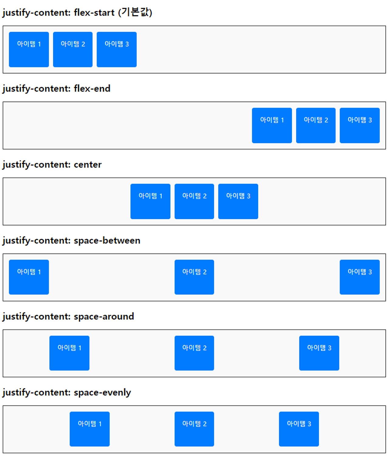
- flex-start : 아이템들을 주 축의 시작 부분에 정렬합니다 (기본값).
- flex-end : 아이템들을 주 축의 끝 부분에 정렬합니다.
- center : 아이템들을 주 축의 가운데에 정렬합니다.
- space-between : 첫 번째 아이템은 시작 부분에, 마지막 아이템은 끝 부분에 정렬하고, 나머지 아이템들은 사이에 고르게 분포시킵니다.
- space-around : 아이템들 주위에 고르게 여백을 분포시킵니다. 아이템 간의 여백은 동일하지만, 첫 번째 아이템과 마지막 아이템의 바깥 여백은 내부 여백의 절반입니다.
- space-evenly : 모든 아이템들을 사이의 여백과 아이템 바깥의 여백이 동일하게 분포되도록 정렬합니다.
시나리오 코드 1
<!DOCTYPE html>
<html>
<head>
<meta charset="UTF-8">
<title>Insert title here</title>
<style type="text/css">
.container {
	display: flex;
	border: 2px solid #333;
	margin-bottom: 20px;
	padding: 10px;
	flex-direction: row;
}

.item {
	background-color: #007bff;
	color: white;
	padding: 20px;
	margin: 10px;
	text-align: center;
	border-radius: 5px;
	width: 150px;
}
</style>
</head>
<body>
	<h2>justify-content: flex-start(기본값)</h2>
	<div class="container" style="justify-content: flex-start;">
		<div class="item">아이템 1</div>
		<div class="item">아이템 2</div>
		<div class="item">아이템 3</div>
	</div>

	<h2>justify-content: flex-end</h2>
	<div class="container" style="justify-content: flex-end;">
		<div class="item">아이템 1</div>
		<div class="item">아이템 2</div>
		<div class="item">아이템 3</div>
	</div>

	<h2>justify-content: center</h2>
	<div class="container" style="justify-content: center;">
		<div class="item">아이템 1</div>
		<div class="item">아이템 2</div>
		<div class="item">아이템 3</div>
	</div>

	<h2>justify-content: space-between</h2>
	<div class="container" style="justify-content: space-between;">
		<div class="item">아이템 1</div>
		<div class="item">아이템 2</div>
		<div class="item">아이템 3</div>
		<div class="item">아이템 4</div>
	</div>

	<h2>justify-content: space-around</h2>
	<div class="container" style="justify-content: space-around;">
		<div class="item">아이템 1</div>
		<div class="item">아이템 2</div>
		<div class="item">아이템 3</div>
		<div class="item">아이템 4</div>
	</div>

	<h2>justify-content: space-evenly</h2>
	<div class="container" style="justify-content: space-evenly;">
		<div class="item">아이템 1</div>
		<div class="item">아이템 2</div>
		<div class="item">아이템 3</div>
		<div class="item">아이템 4</div>
	</div>

</body>
</html>
'HTML CSS' 카테고리의 다른 글
| FlexItem - flex 속성 (0) | 2024.07.15 |
|---|---|
| 교차축 정렬 (align-items, align-content) (0) | 2024.07.15 |
| flex-wrap 속성 (0) | 2024.07.15 |
| flex-direction 속성 (0) | 2024.07.15 |
| Flexbox (2) | 2024.07.11 |
'HTML CSS' Related Articles
more


