
햄발
교차축 정렬 (align-items, align-content) 본문
교차축 정렬
Flexbox 레이아웃에서 교차축(cross axis) 은 주 축(main axis)에 수직인 축 을 의미합니다. 교차축 정렬은 이 축을 따라 Flex 아이템들을 배치하는 방법입니다. 주 축이 수평 방향일 때 교차축은 수직 방향이 되고, 주 축이 수직 방향일 때 교차축은 수평 방향이 됩니다. 교차축 정렬을 위해 두 가지 주요 align-items와 align-content 속성을 사용합니다.
align-items
align-items 속성은 Flex 컨테이너 내의 개별 Flex 아이템들을 교차축을 따라 정렬합니다. Flex 컨테이너의 높이와 관계없이 각 아이템의 위치를 지정할 수 있습니다.
- flex-start: 아이템들을 교차축의 시작 부분에 정렬합니다.
- flex-end: 아이템들을 교차축의 끝 부분에 정렬합니다.
- center: 아이템들을 교차축의 가운데에 정렬합니다.
- baseline: 아이템들을 텍스트의 기준선에 따라 정렬합니다.
- stretch (기본값): 아이템들을 Flex 컨테이너의 높이에 맞게 늘립니다.
align-content
align-content 속성은 Flex 컨테이너 내에서 여러 줄의 Flex 아이템들을 교차축을 따라 정렬합니다. 이는 단일 행 또는 단일 열이 아닌 여러 줄의 Flex 아이템을 조정할 때 사용됩니다.
- flex-start: 줄들을 교차축의 시작 부분에 정렬합니다.
- flex-end: 줄들을 교차축의 끝 부분에 정렬합니다.
- center: 줄들을 교차축의 가운데에 정렬합니다.
- space-between: 첫 번째 줄은 시작 부분에, 마지막 줄은 끝 부분에 정렬하고, 나머지 줄들은 사이에 고르게 분포시킵니다.
- space-around: 줄들 주위에 고르게 여백을 분포시킵니다.
- stretch (기본값): 줄들을 Flex 컨테이너의 높이에 맞게 늘립니다.
시나리오 코드 1
<!DOCTYPE html>
<html>
<head>
<meta charset="UTF-8">
<title>Insert title here</title>
<style type="text/css">
.container {
	display: flex;
	flex-wrap: wrap;
	border: 2px solid #333;
	padding: 10px;
	height: 350px;
	background-color: #f9f9f9;
	flex-direction: row;
}

.item {
	background-color: #007bff;
	color: white;
	padding: 20px;
	margin: 10px;
	text-align: center;
	border-radius: 5px;
	width: 150px;
}
</style>
</head>
<body>
	<h2>align-items: stretch </h2>
	<div class="container" style="align-items: stretch;">
		<div class="item">아이템 1</div>
		<div class="item">아이템 2</div>
		<div class="item">아이템 3</div>
	</div>

	<h2>align-items: flex-start</h2>
	<div class="container" style="align-items: flex-start;">
		<div class="item">아이템 1</div>
		<div class="item">아이템 2</div>
		<div class="item">아이템 3</div>
	</div>

	<h2>align-items: flex-end</h2>
	<div class="container" style="align-items: flex-end;">
		<div class="item">아이템 1</div>
		<div class="item">아이템 2</div>
		<div class="item">아이템 3</div>
	</div>

	<h2>align-items: center</h2>
	<div class="container" style="align-items: center;">
		<div class="item">아이템 1</div>
		<div class="item">아이템 2</div>
		<div class="item">아이템 3</div>
	</div>

	<!-- 잠깐 문제   -->
	<h2>정 가운데로 정렬해주세요</h2>
	<div class="container" style="align-items: center; justify-content: center;">
		<div class="item">아이템 1</div>
	</div>

</body>
</html>

풀이
<!DOCTYPE html>
<html>
<head>
<meta charset="UTF-8">
<title>Insert title here</title>
<style>
.container{
display: flex;
flex-wrap: wrap;
border: 2px solid #333;
padding: 10px;
height: 350px;
background-color: #f9f9f9;
}
.item{
background-color: rgb(187, 0, 0);
color: #fff;
padding: 20px;
margin: 10px;
text-align: center;
border-radius: 5px;
width: 500px;
}
</style>
</head>
<body>
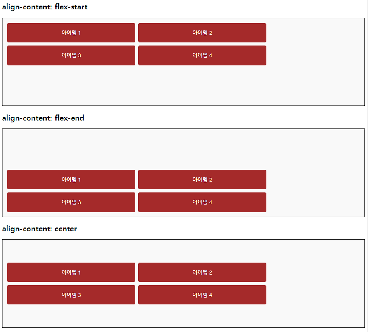
<h2>align-content: flex-start</h2>
<div class="container" style="align-content: flex-start;">
<div class="item">아이템 1</div>
<div class="item">아이템 2</div>
<div class="item">아이템 3</div>
<div class="item">아이템 4</div>
</div>
<h2>align-content: flex-end</h2>
<div class="container" style="align-content: flex-end;">
<div class="item">아이템 1</div>
<div class="item">아이템 2</div>
<div class="item">아이템 3</div>
<div class="item">아이템 4</div>
</div>
<h2>align-content: center</h2>
<div class="container" style="align-content: center;">
<div class="item">아이템 1</div>
<div class="item">아이템 2</div>
<div class="item">아이템 3</div>
<div class="item">아이템 4</div>
</div>
<h2>align-content: space-between</h2>
<div class="container" style="align-content: space-between;">
<div class="item">아이템 1</div>
<div class="item">아이템 2</div>
<div class="item">아이템 3</div>
<div class="item">아이템 4</div>
</div>
<h2>align-content: space-around</h2>
<div class="container" style="align-content: space-around;">
<div class="item">아이템 1</div>
<div class="item">아이템 2</div>
<div class="item">아이템 3</div>
<div class="item">아이템 4</div>
</div>
<h2>align-content: stretch (기본값)</h2>
<div class="container" style="align-content: stretch">
<div class="item">아이템 1</div>
<div class="item">아이템 2</div>
<div class="item">아이템 3</div>
<div class="item">아이템 4</div>
</div>
</body>
</html>
'HTML CSS' 카테고리의 다른 글
| 웹페이지 레이아웃 구성 (0) | 2024.07.15 |
|---|---|
| FlexItem - flex 속성 (0) | 2024.07.15 |
| justify-content (0) | 2024.07.15 |
| flex-wrap 속성 (0) | 2024.07.15 |
| flex-direction 속성 (0) | 2024.07.15 |
'HTML CSS' Related Articles
more


